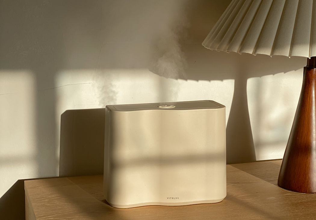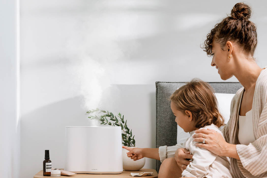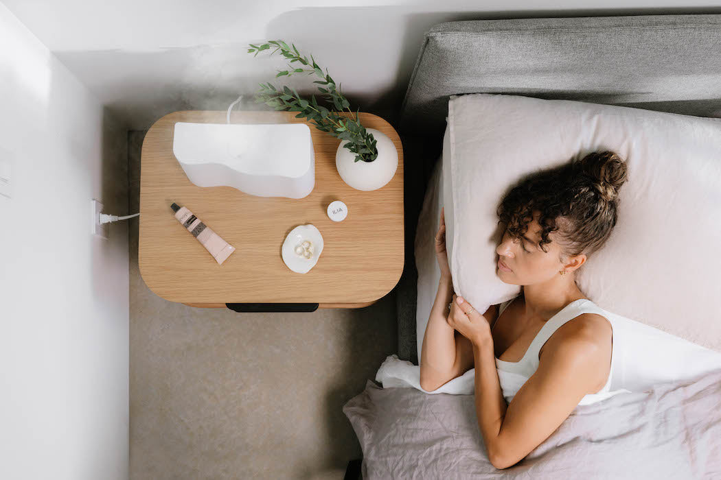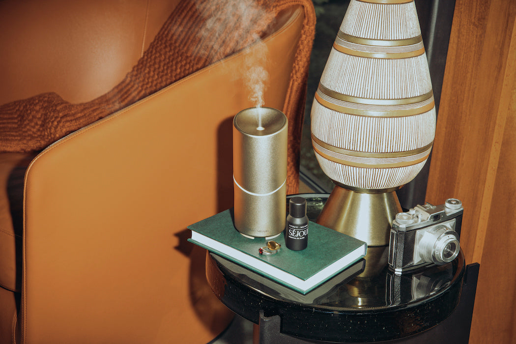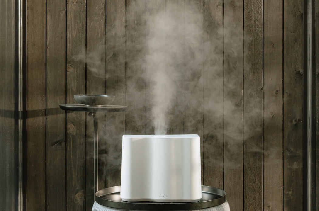
The Cloud Humidifier is vitruvi’s most innovative and performance-driven product to date. Designed to look beautiful on a nightstand while also being easy to use and working highly effectively to hydrate the air in your home, it’s a must-have for any space.
So, how does something like this come to life? We asked Harrison Gill, who designed Cloud, to walk us through his process.
This is the most technical product vitruvi has ever made. How did you go about the design process?
It started with some research regarding the types of humidifier, such as ultrasonic versus evaporative. Ultrasonic was an easy decision for us because we were familiar with the technology—since we use it for our diffusers. Plus, who doesn’t love to see a big cloud of mist coming out of your humidifier? After that it was onto a more specific feature set, and then the fun stuff: design, shape, and form.
What were the main problems you wanted to solve with Cloud?
Ease of use was huge; so many humidifiers have tedious filling processes that really hurt the user experience. Being something you will likely use every night, we wanted ours to be simple; the removable water bucket makes it so easy to fill.
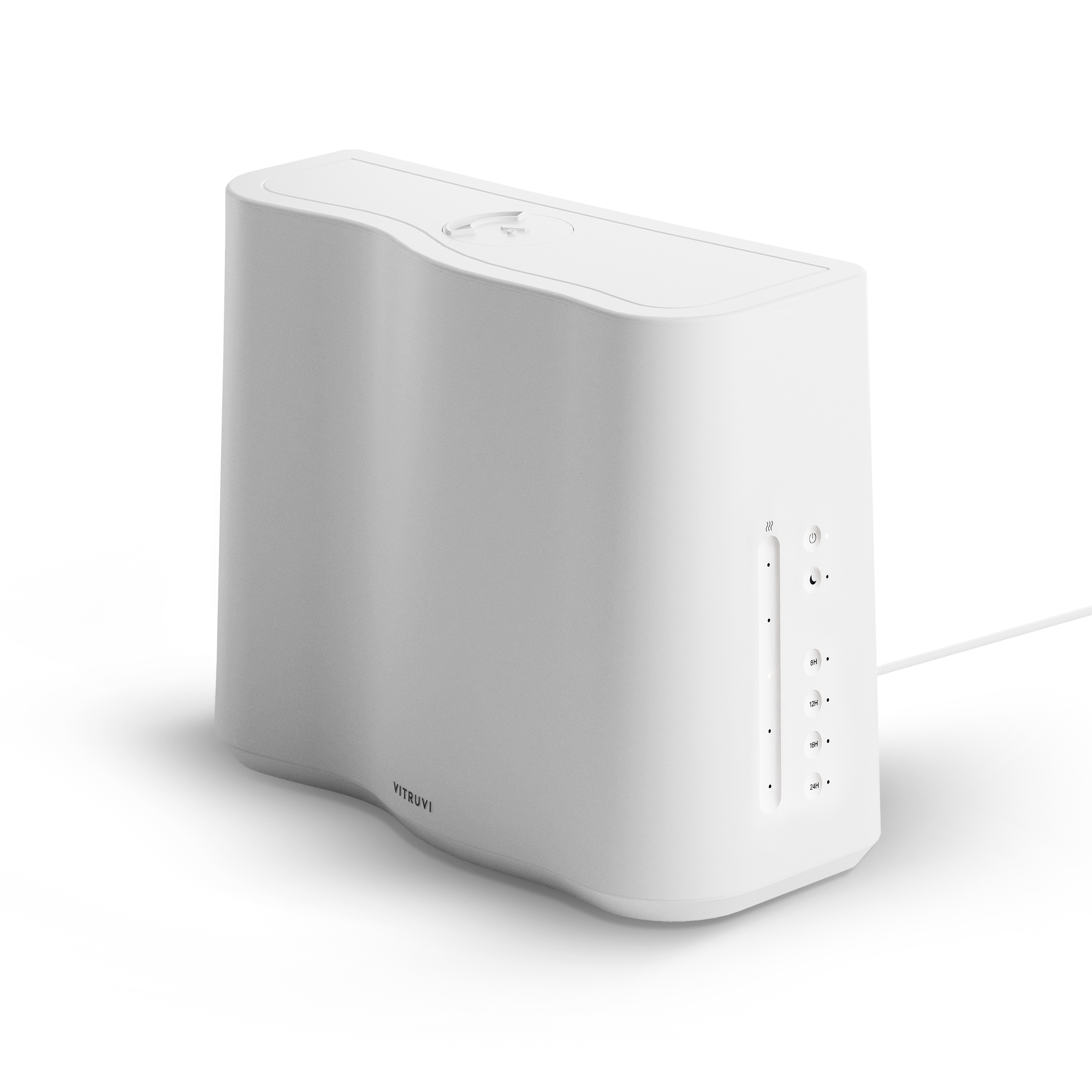
Space and size were other big ones. Ours is designed as a slim, organic rectangle; many others are round and typically chunky. Most people place their humidifier on their nightstand, which is also a spot for other items like books, cups, and your phone. So we wanted to make Cloud versatile and small enough to live on the busiest of nightstands.
How does Cloud stand out against other humidifiers on the market?
Like our other products—which always put design at the forefront—it doesn’t look like a traditional humidifier. It’s modern, sleek, and sculptural at the same time; it doesn’t look clinical or medicinal. The shape and design make us stand out. And the ease of use is like no other humidifier; simply take the bucket to your sink, fill it up, and pop it back in.
How many iterations of the shape did you go through to land on the final one?
Once I landed on the general direction of this shape, it took seven or eight iterations to land on the final design. These iterations consisted of small curvature changes, angles, how round the corners were, tapering from top to bottom, and different button configurations.
Walk us through the design process in a bit more detail. What comes first? Shape? Features? Materials?
Features definitely drive the direction; we need to nail down the feature set in order to really dive into shape. Once we have a basic list of features, it’s all out physical design and seeing how we can solve the issues we’ve seen in the market—like space-saving design and ease of use. And we think about the type of technology that we want to use to humidify a space, and how the shape can compliment all these things. Materials go hand in hand with shape; we think about what material will be the best fit for the design of the product.
So essentially, everything is happening at the same time until the project is about 90 percent done. That last 10 percent is when things like features and materials separate, which is the final tuning of all functionality—like tweaking specific features and buttons, and ensuring the molds are perfect.
How does it feel to see this product out in the world now?
It’s always a bit surreal at first. As the designer, I never truly experience the initial reveal or first look, because when designing the product I get to see it slowly come to life from concept to drawings, renderings, color samples, 3D-printed models, and eventually the final result. The entire process is exciting, but it’s not until it finally launches that the product development team reflects on what we’ve done. So to see it out in the world is super rewarding; it makes us appreciate the process and the work put into it.
Can you dive into the colors you chose for the debut collection?
White: it plays off our classic vitruvi white, which is a warmer hue. A lot of what’s out there in electronics is a very stark bright white; our white has always aimed to be softer and inspired by ceramics.
Dove: we wanted a dark option; After looking at a few grays, we landed on this warmer dark one.
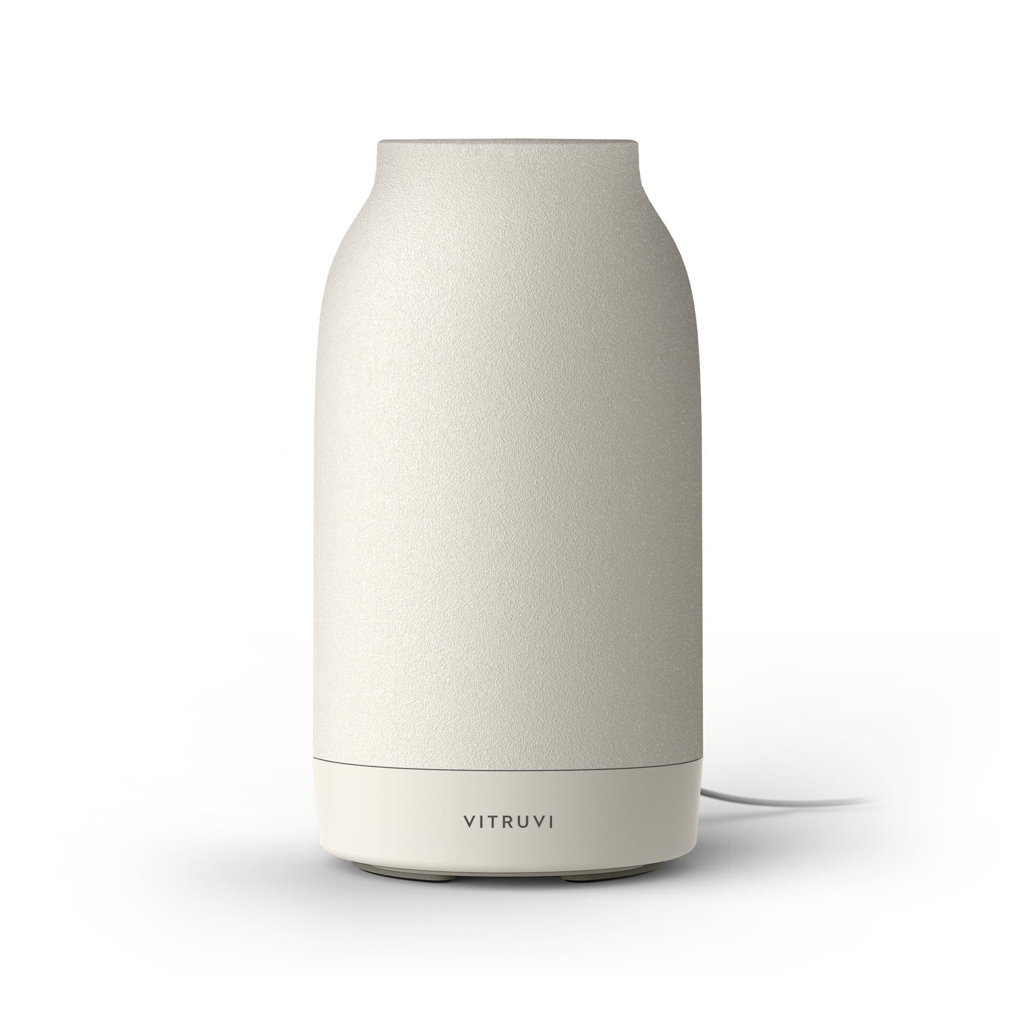
Oat: it’s a beautiful off-white tone inspired by warm linens and oat milk lattes.
Is there anything else you’d like to add?
I just can’t wait for people to start using it. It’s so simple and easy to use, and looks beautiful at the same time.