Since starting vitruvi in 2015, we have always listened to our community and have had the honor of growing with them. As a design-first brand, we are constantly looking at how we can evolve and push ourselves creatively. For the next chapter of vitruvi, we wanted to usher in a new way of navigating scent for our customers.
This rebrand has been almost two years in the making. It was a labor of love between our internal team and our design agency Aruliden, and doing it remotely brought creative challenges to what was already a multifaceted project. It involved teams in Vancouver, California, New York, and even Europe; there were a lot of time zones to juggle.
The main goals were to create design cohesion across our collections and to tell a visual scent story. We wanted to add sensorial elements to the entire collection through texture, color, and, of course, aroma.
I’m so excited for you to see and touch and feel the products that we spent so much time creating for you. I am also excited for our new website to be out in the world; we wanted to showcase a range of interiors and also help our audience view our product in more detail. And, perhaps most of all, I am excited for the conversations and beautiful moments that I hope these scents will be part of in your life.
New tagline
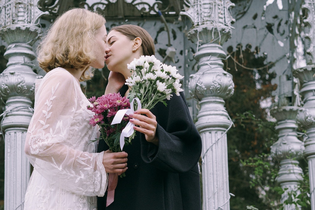
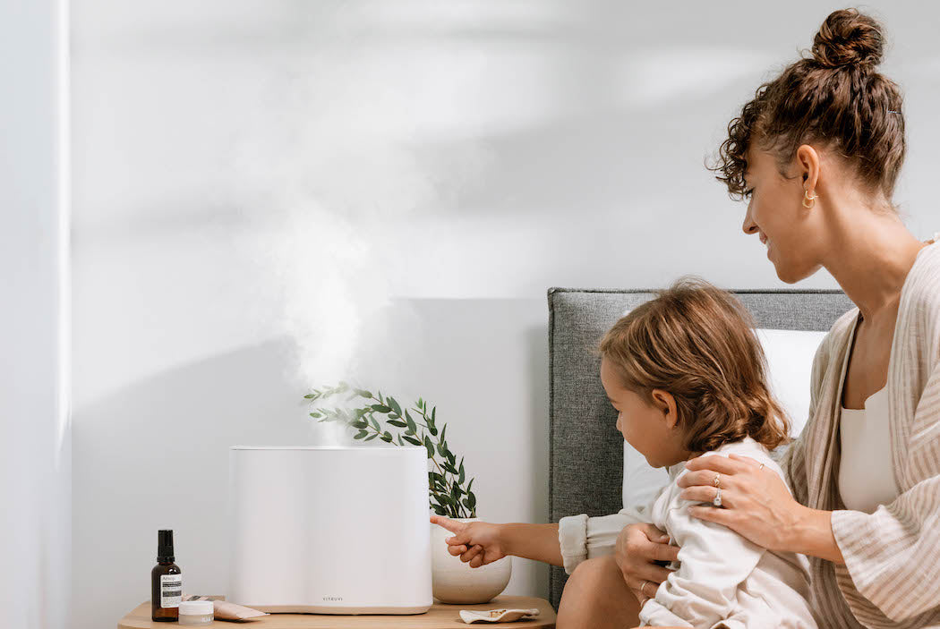
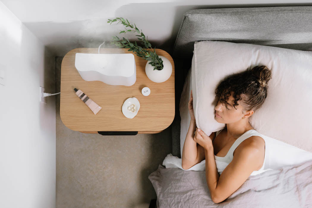
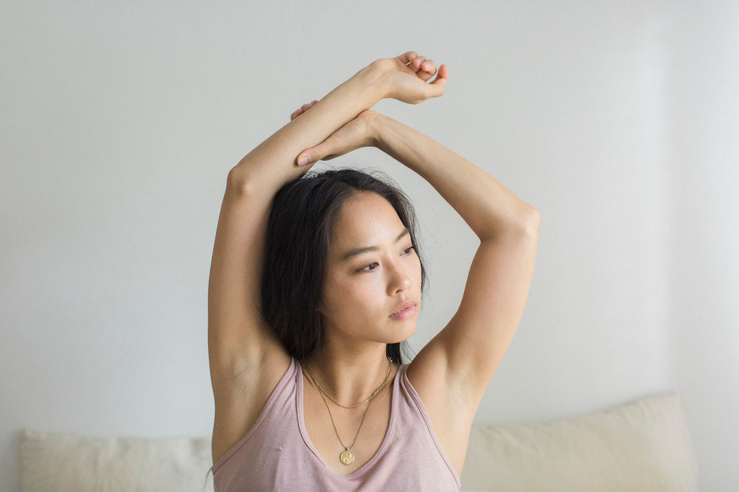
As a home scenting company, we believe that the air in your home tells a story about who you are and how you want to show up in the world. Our new tagline is Make The Air Yours, and to me, it means taking ownership of your space, commanding the room, and putting your touch and personality into the aroma of your home. After all, just like music, decor, and design speak to who we are, so does aroma. Traditional home scenting products use toxic ingredients to mask odor, but at vitruvi we believe it’s time for a different kind of air—one that’s light and beautiful, and that says something about you.
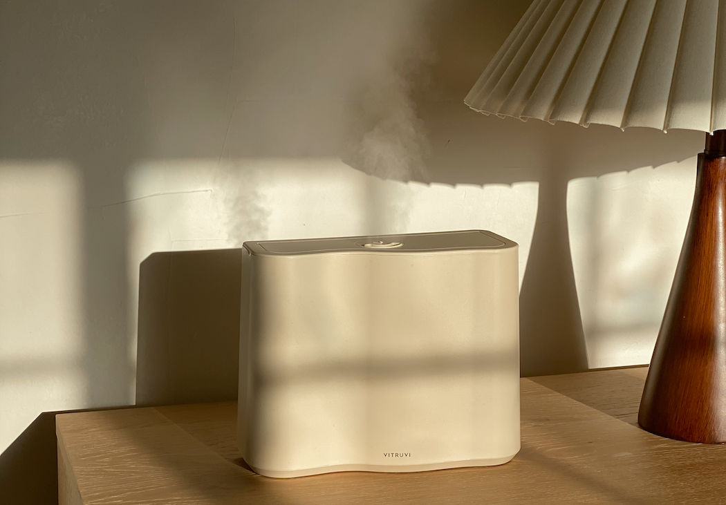
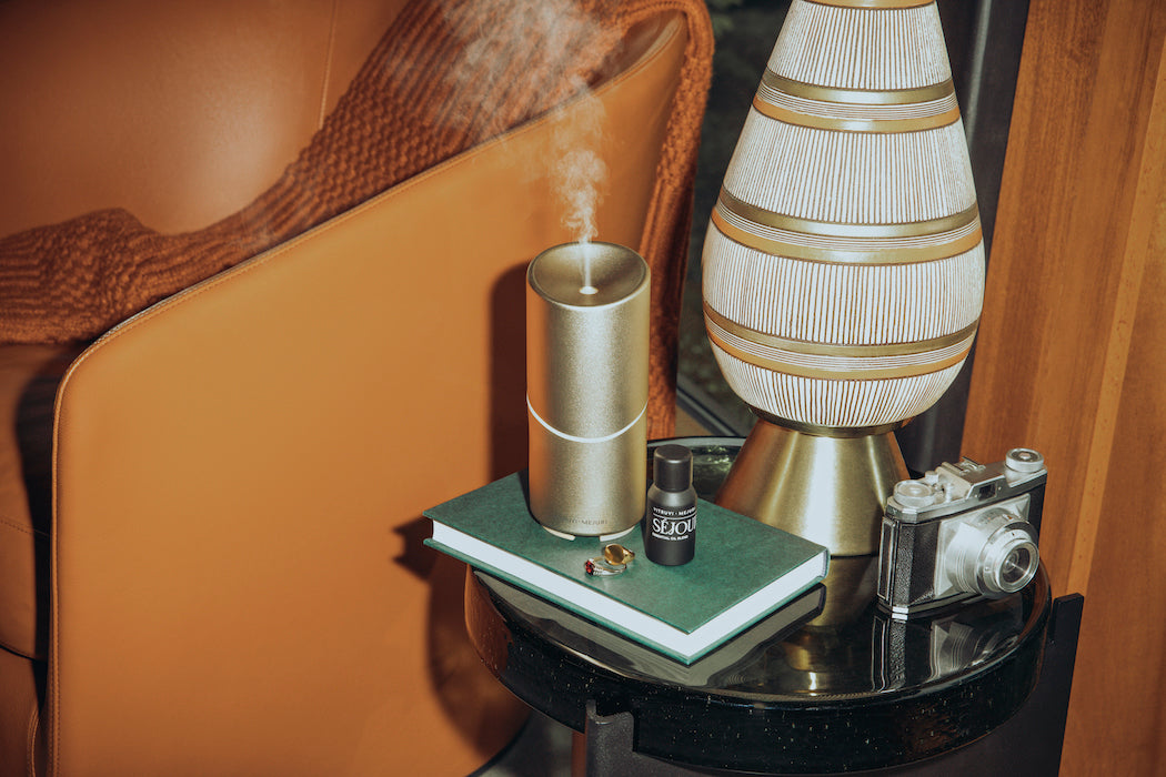
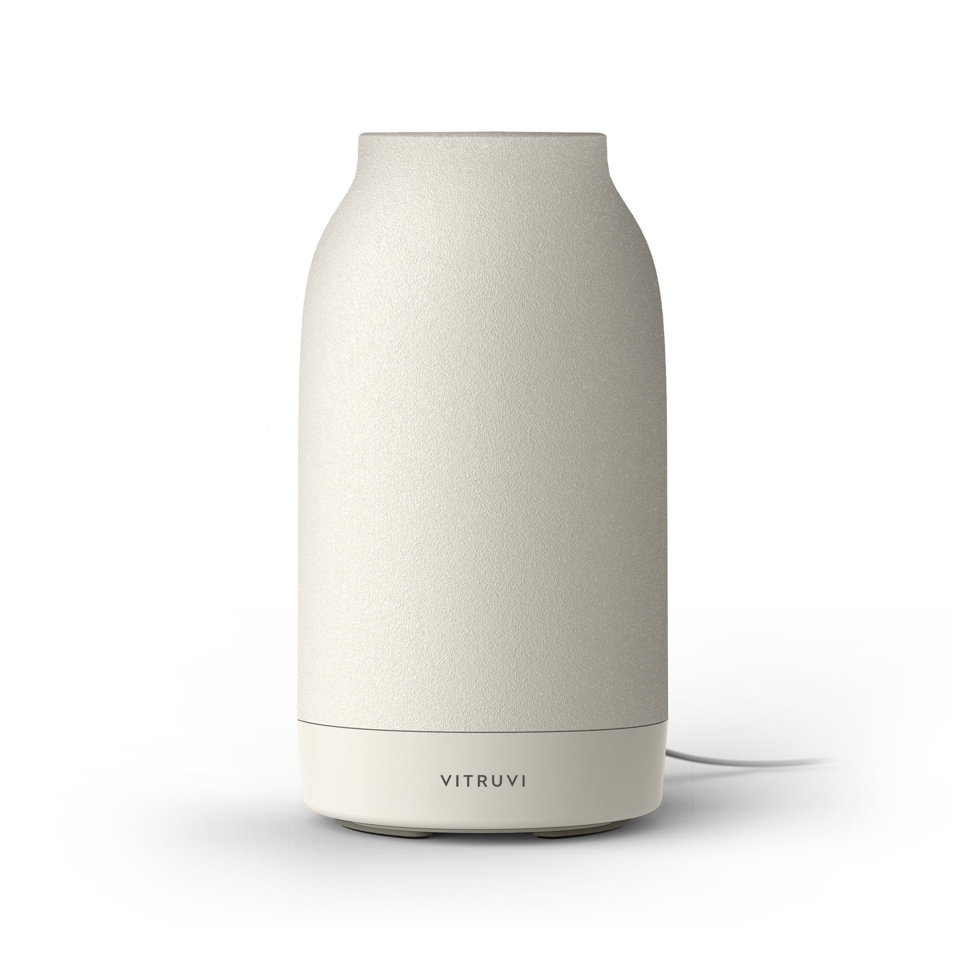
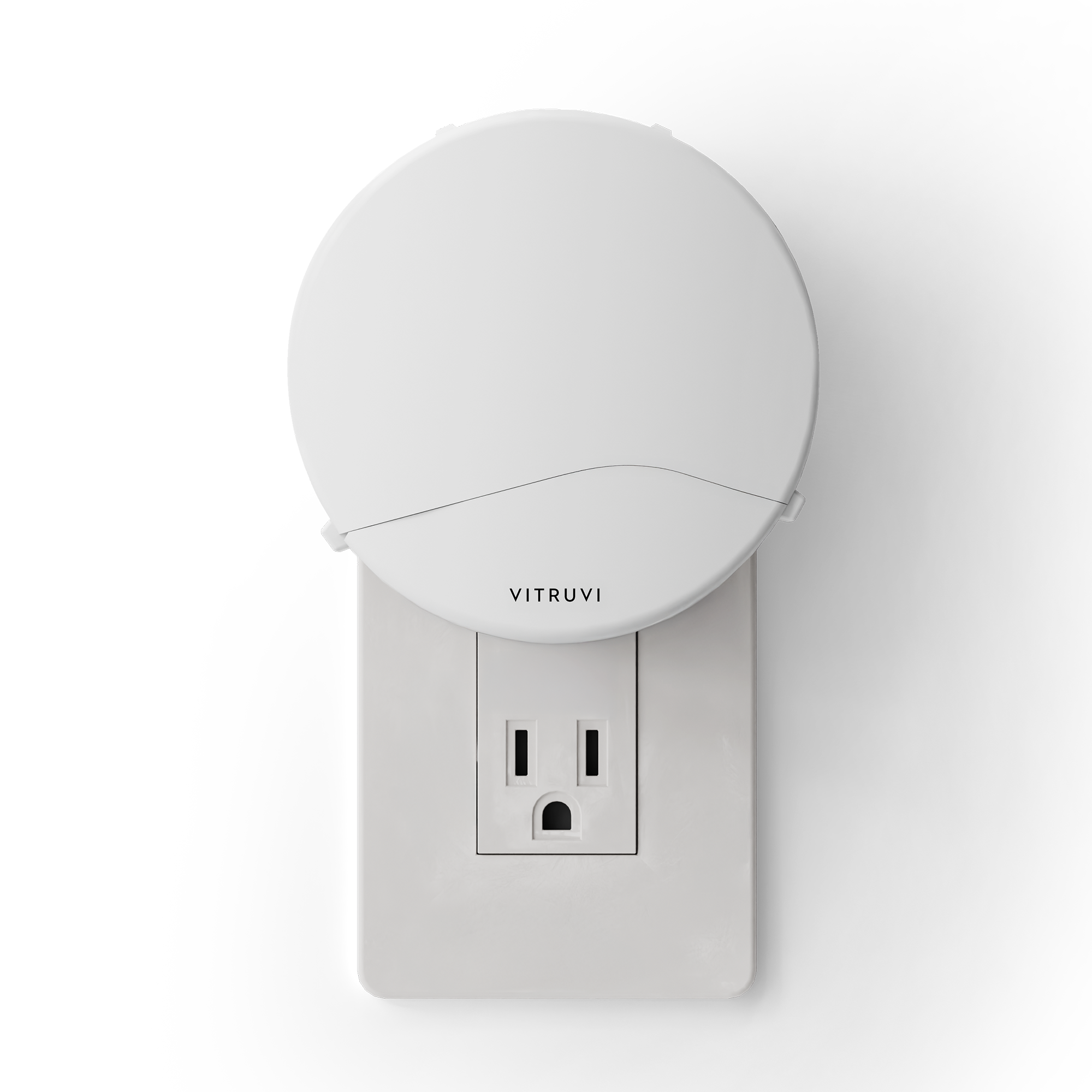
New packaging
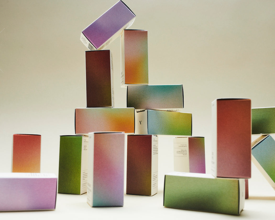
We asked ourselves, “What does scent look like?” If you were to put our blends in the air and put a glass box around them, what would their aromas look like in color and texture? What tones do our aromas convey? This was such a thought-provoking creative pursuit, and resulted in the color gradients on our blend and essential oil boxes, as well as on design elements across the rebrand.
We balanced that question with the beauty of age. I wanted our new boxes to feel lived-in, with the textures of the paper and bottles offering a sensorial experience. We tirelessly worked to perfect a balance of cleanliness with depth and permanence. With our new bottles, we wanted them to feel like intentional objects that could sit on a vanity or desk, like a personal fragrance does. They’re designed to take up space, have weight, and provide a sense of belonging in your home.
New hero font
We wanted an expressive font that evoked movement and could be used as an impactful design element. Our new font allows us the opportunity to be more bold in our design; we also created custom connections between specific letters in our blend names, which was done to generate movement within the text.
Going forward
My intention is that this rebrand enhances every vitruvi touchpoint for you—from navigating our website, to getting inspired by the dynamic range of interiors we showcase on our social channels, to feeling a sense of elevation in our product experience overall. Each and every detail was chosen in a tireless pursuit of excellence. My goal is that we always show up with a quality that is worthy of your spaces. I am so honored to make products for you and to have a place in your home.